Web Design
OSP Ecommerce - Designing for the world
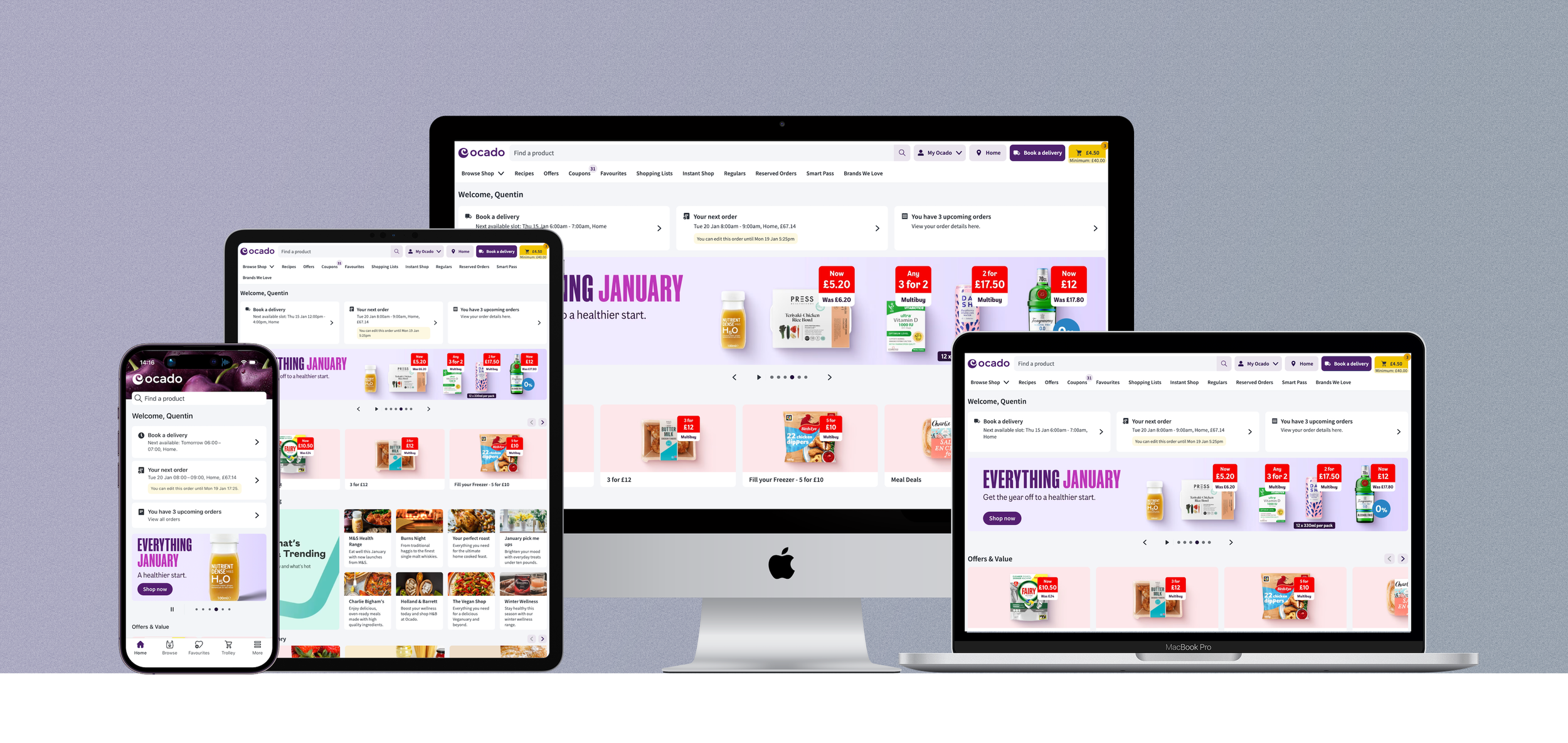
My role within the Ocado Smart Platform (2017 to present) focused on overseeing the customer facing part of the platform: the Ecommerce channels. This included our Webshop and mobile apps. Fully responsive and React-based, our website aims to deliver a seamless shopping experience, no matter the device the user is on. As a UX Designer first, and then as UX Manager/Director, my focus varied between working on new features and supporting the team with their projects. One of the many challenges on the job, was to keep all our interfaces in sync with our design system, while allowing each retailer to bring their brand to life on the platform.
Internationalisation as well as UI flexibility are some of the top challenges we currently face. How can we build a resilient platform, capable of onboarding several retail partners around the world, catering for their unique needs, while allowing them more and more flexibility at all levels: branding, UI, UX… Below are examples from four of our retail partners. Notice the similarities and differences between each pages.
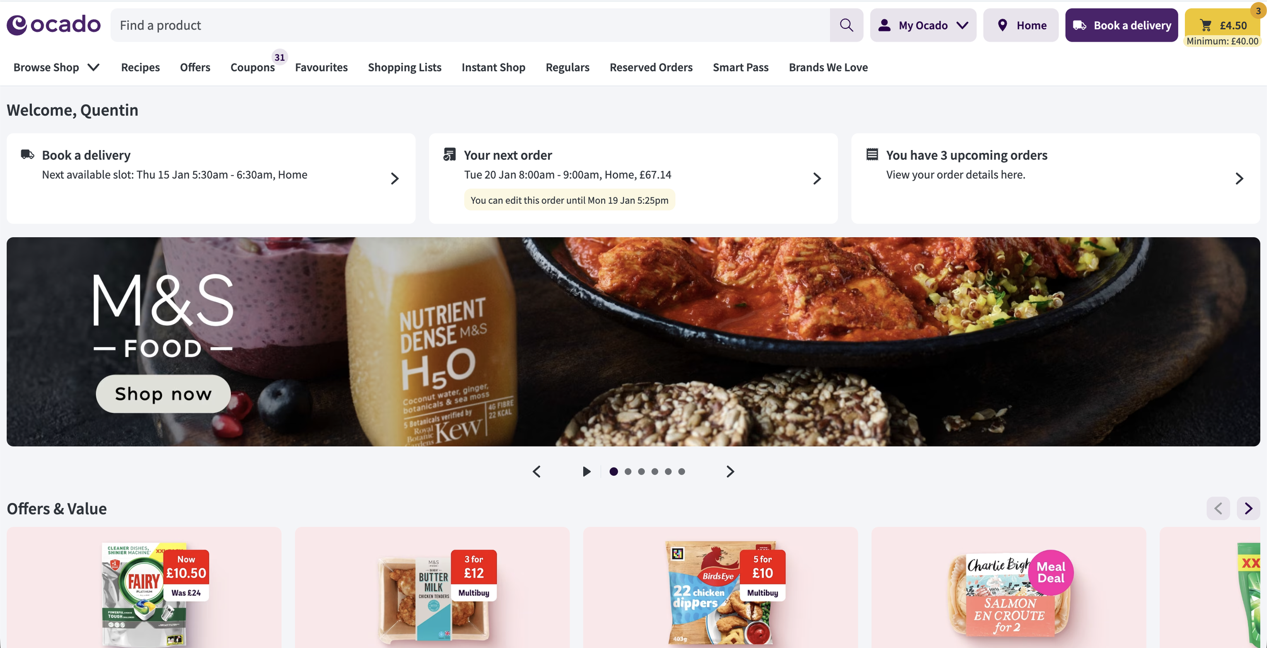
Ocado 🇬🇧
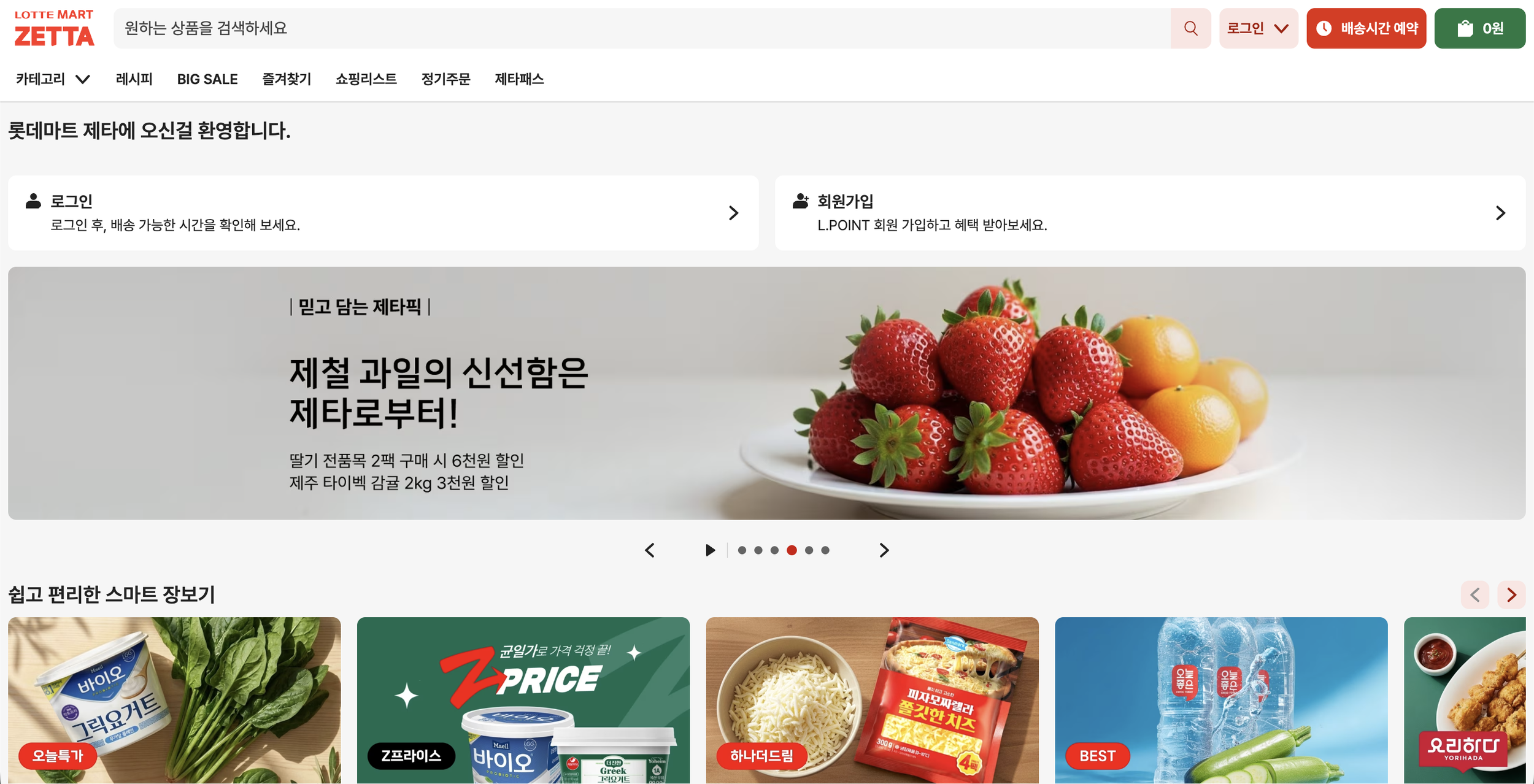
Lotte 🇰🇷
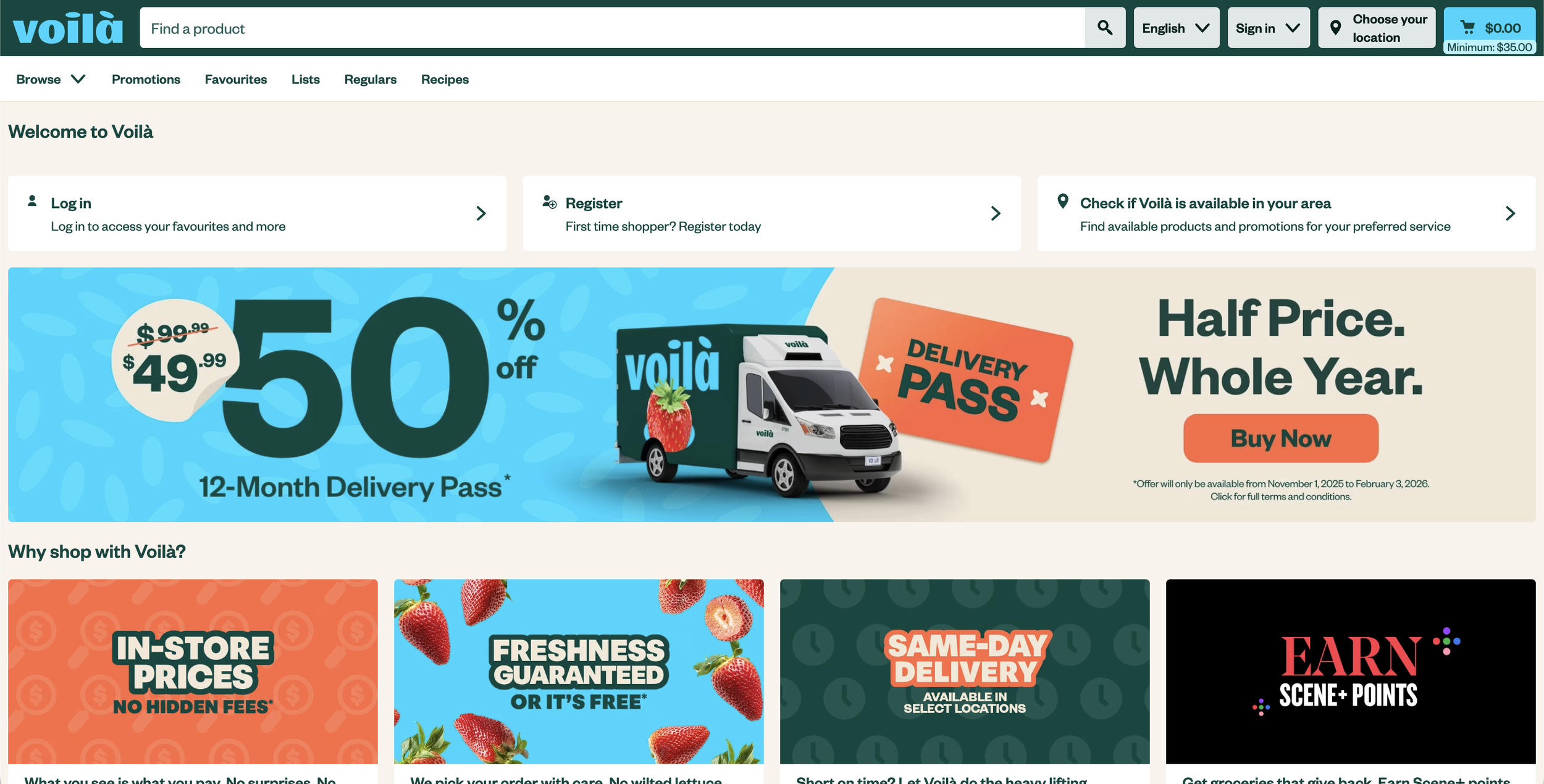
Voila 🇨🇦
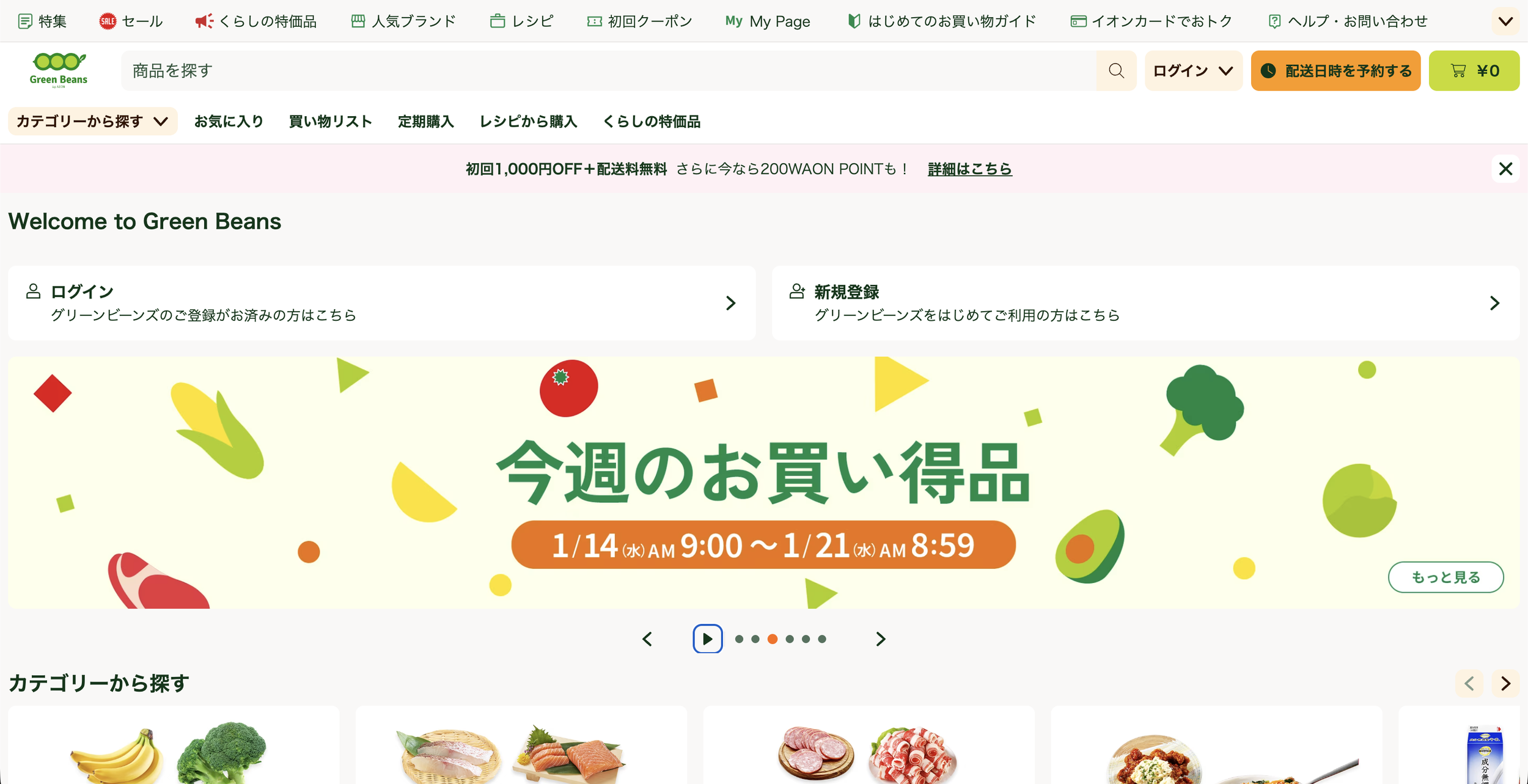
Green Beans 🇯🇵
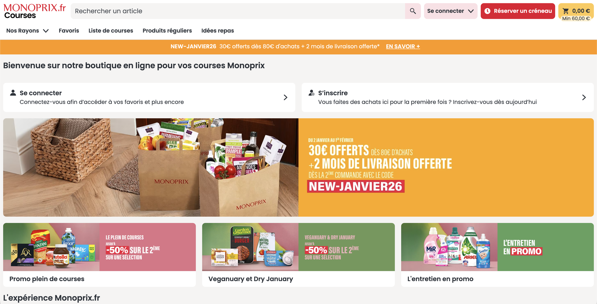
Monoprix 🇫🇷
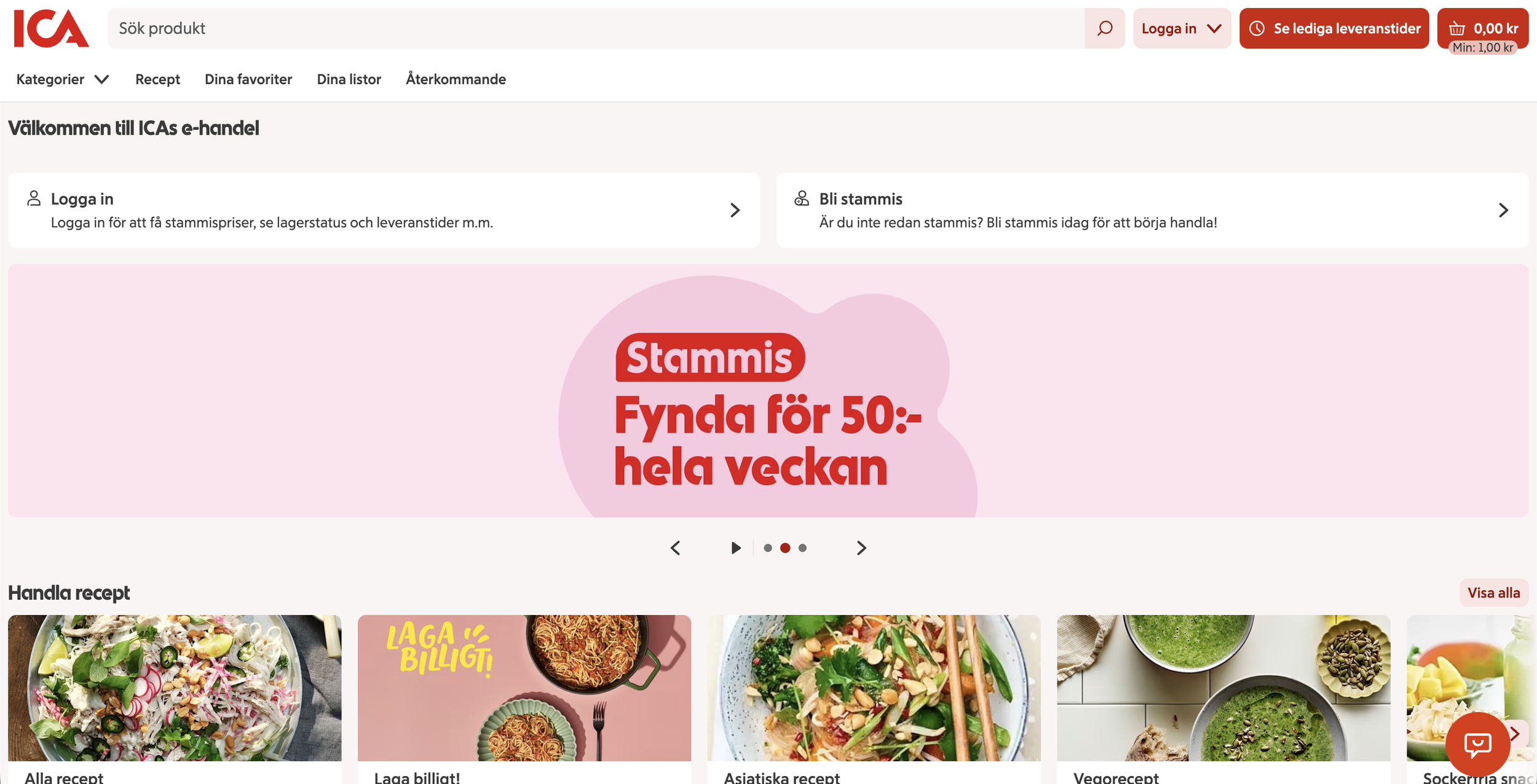
ICA 🇸🇪
Designing - Self Service Refunds
More context about this project can be found on the app page.
A seamless cross channel experience is something I strongly pushed forward during my time in OSP Ecommerce. This meant that we would design our solutions across apps and web simultaneously. This approach helped us maintain consistency, and also brought mobile and web closer, breaking down the organisational silos. All engineers would work from the same files, and therefore a single source of truth was achievable. The video below is the web version on the project described on the app page.

Checkout.com - Payments made simple
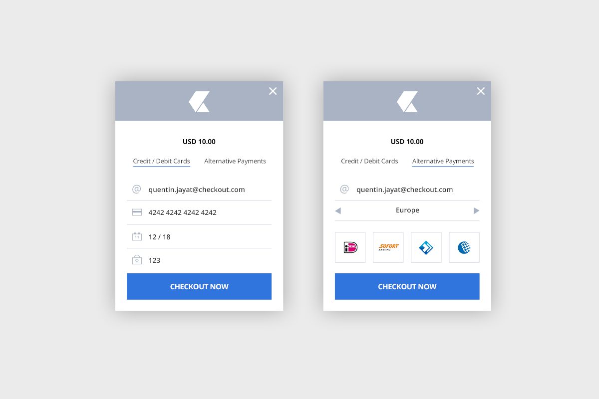
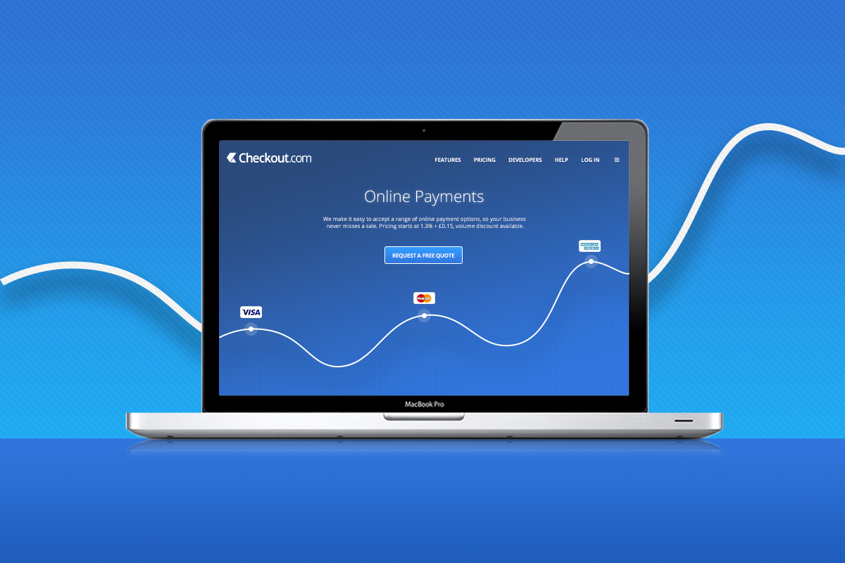
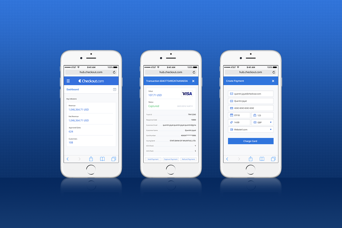
If you’re into Fin-Tech, then you’ve probably heard about this startup, breaking up investment records and conquering the payment world. During my time there (2015-2016), as the sole UX Designer in the company, my focus was quite varied and gave me a really good exposure to several parts of the product. This ranged from proposing designs for the payment widget merchants can install on their website, to helping Marketing with highly-converting landing pages (18% CVR), tested and improved via several rounds of A/B testing. As a B2B company, my role also involved creating dashboards for retailers to track and oversee their payment solution and transactions. From fraud management, to profit reporting, enabling businesses to make the best of their Checkout.com integration.

Thrillcity - Events for Londoners
Travelling back in time to when I arrived in London for my first internship in the Design world (2011), I landed at Thrillcity, a young startup with the big mission to revolutionise the event industry. During my 4 years there, I gained a wide range of experience, from print and marketing collaterals, to web and app design where I specialised during my last years as the company was significantly shifting its product offering online.
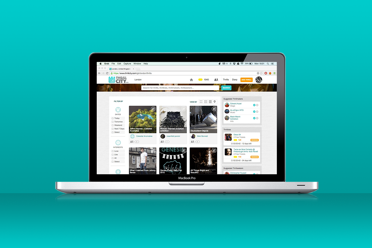
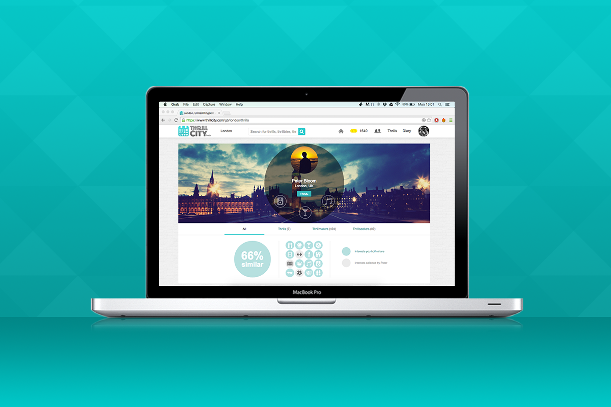
The idea was simple: creating a platform for promoters (music, culture, arts, food & drinks, entertainments…) to upload their events, and for Londoners to buy tickets and never get bored. The screenshots below are from the website, late 2014.. The first one shows where users could find the events for a specific date or interest. The last one shows a typical user profile, using algorithms to determine similarity between profile owner and viewer based on selected interests. This was based on the assumption that users could follow like-minded folks, and never miss out!
Thillcity.com isn’t live anymore, but its twitter is a nice reminder of what we accomplished then.

