B2B
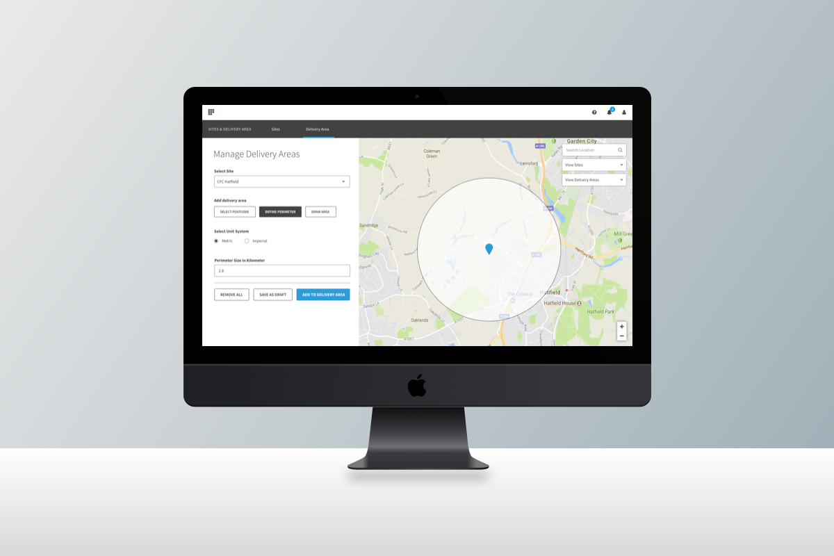
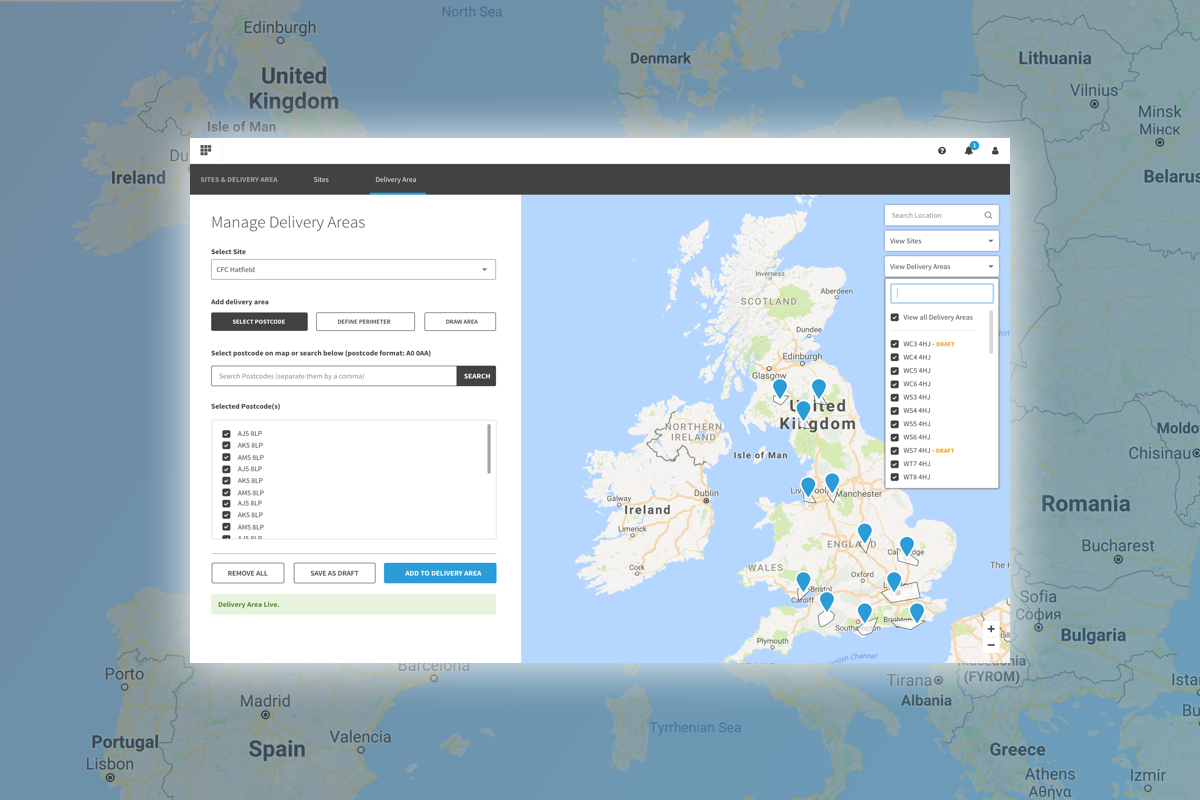
OSP Delivery Area
Before fully specialising into the Ecommerce part of the Ocado Smart Platform, I spent a bit of time working on the B2B side of the product. I had the chance to work on the Delivery Area system, which allows retailers to select a geographical range from which customers can place their orders and get it delivered. For instance, if a retailer has a warehouse based in London, they should be able to select an area around London from where it is still cost efficient to deliver to. A user based in Scotland shouldn’t be able to place an order.
Although the interface already existed before I joined, my work focused on making the map element much bigger (2/3 of the screen) and allowing retailers to select areas using different methods, ie: select postcodes, a radius or even draw an area with dropped-in pins. This became a necessity given the diversity of the countries where our clients are based. in the UK, postcodes are everything, and they match small areas, like a street or few houses. But in France, one postcode is for a whole city.
Interviewing the retailer’s employees responsible for this job, I refined the MVP to scale it down and focus on features that were key to them, such a saving an area “as a draft”, something I didn’t even think of during my early designs. “Talk to your users” is a lesson that we always need to remember.
Sadly, I didn’t get to see these solutions implemented, Ecommerce was calling and I couldn’t resist.
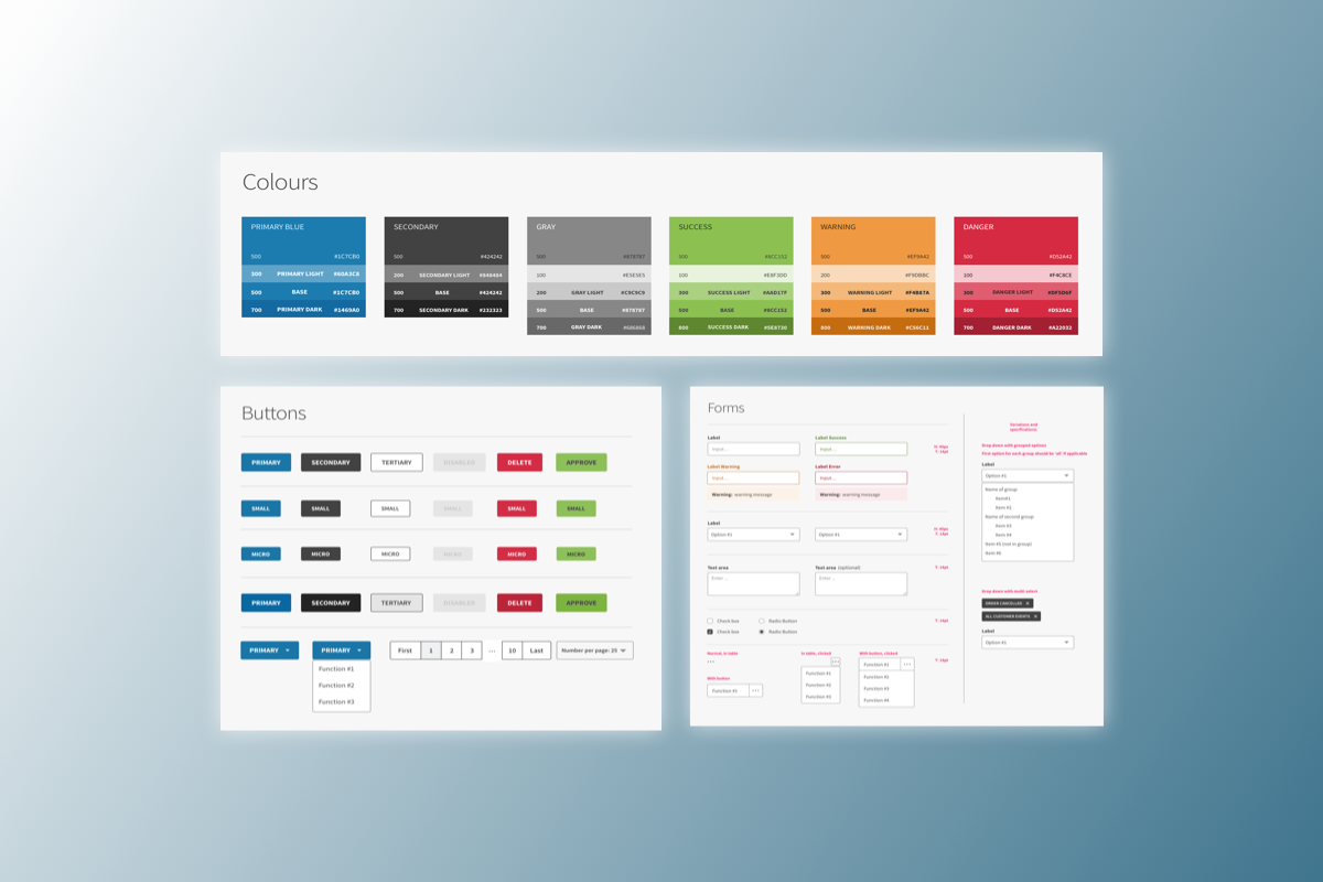
Checkout.com - Dashboards for all!
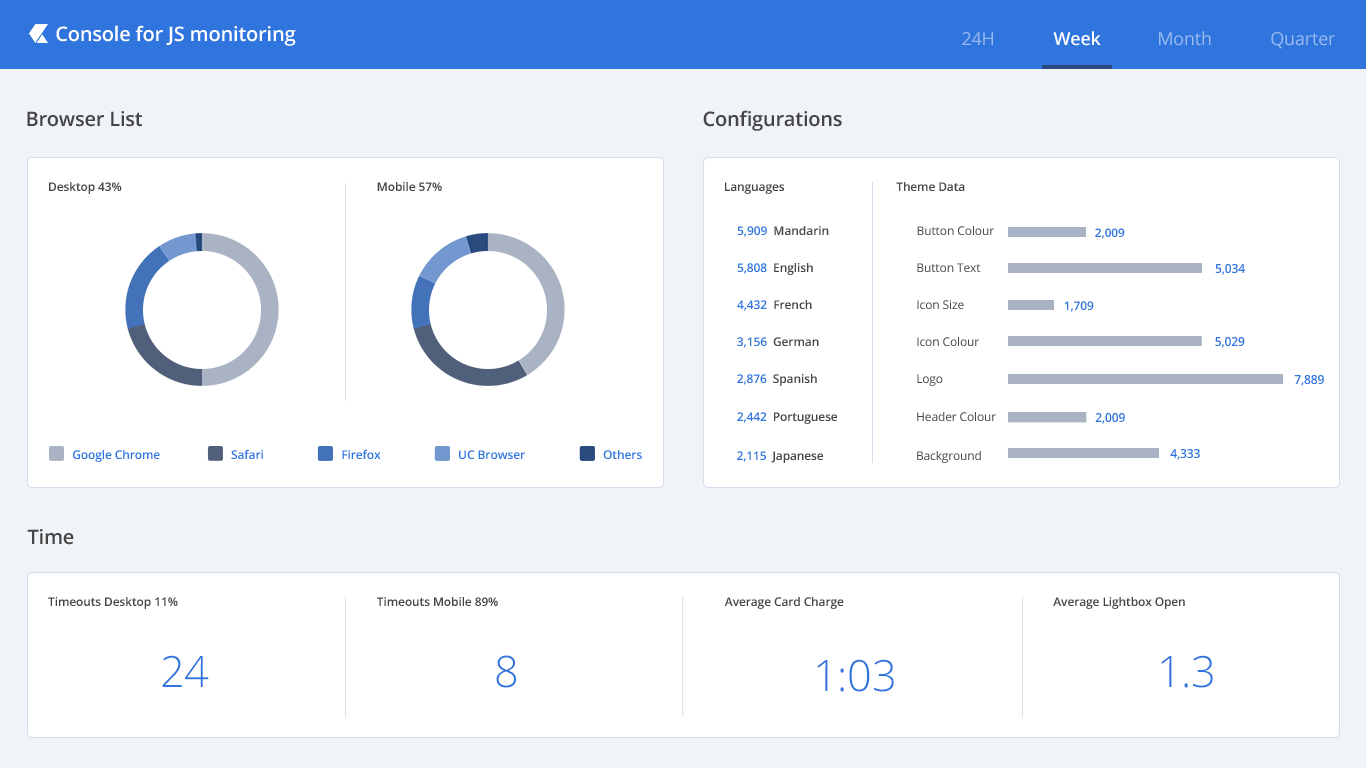
Dashboards! Who wants some dashboards?! At checkout.com I worked on numerous dashboards for several use cases. In the B2B, Fin-Tech industry, it’s all about payment and efficiency, enabling users to scan vast amount of data quickly so that they can take the best decisions. The dashboard below was for an internal audience, allowing our Product and Engineering team to envision the usage of the payment widget configured on the merchants’ website. Tracking where are shoppers coming from, what is the most popular configuration… With this information, we wanted to know where to focus next, which feature we could improve, and which one we could remove.